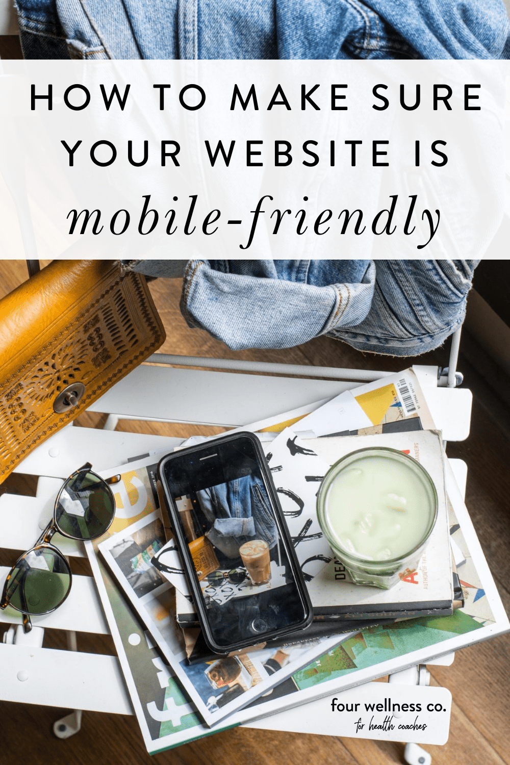
How to Make Sure Your Health Coaching Website Is Mobile-friendly

This post contains affiliate links, through which we may earn a small commission if you choose to purchase, at no additional cost to you. We only share products or services we personally use & recommend!
I’m putting my blue-light-blocking nerdy girl computer glasses on for this post! 🤓
As you may know, in addition to being an integrative nutrition health coach, I’m also a web designer.
One of my tasks as a web designer is ensuring that my clients’ website look great on mobile devices. Why? Ooh, I’m glad you asked!
What is mobile-friendly web design?
Mobile responsive web design is incredibly important in building or maintaining a website these days.
A greater percentage of global internet traffic now occurs on mobile devices than on desktop computers—in a sense, making a mobile-friendly website even more important than a site that’s beautiful on desktop.
Online searches are also trending in the same direction: over 60% of Google searches are now performed on mobile. To accommodate for this, search engine algorithms are increasingly prioritizing mobile-friendly sites—which means that websites built with mobile responsive design, that load quickly on mobile devices, and that provide a good mobile user experience are more likely to rank highly in search results (woohoo!).
So, due to increased traffic & search queries from mobile devices, it’s essential that your health coaching website is designed to be mobile-friendly.
One of the reasons I use and recommend Squarespace websites for health coaches and wellness entrepreneurs is that Squarespace websites are, by default, built with mobile responsive design. Mobile responsive design means that elements on your website will automatically adapt to fit the size of the screen your website is being viewed on—whether that’s a desktop computer, smartphone, or tablet.
However, even though Squarespace has your back with built-in mobile responsive design, there are a few additional things to consider when designing your health coaching website with mobile users in mind:
Page load time
Mobile legibility
Mobile navigation design
Let’s chat through what all of this means for optimizing your health coaching website.
8 WAYS TO MAKE YOUR WEBSITE MORE MOBILE-FRIENDLY
Here are my top tips for ensuring mobile-friendly design on your health coaching website:
Increase page load speed
Page load speed is a significant part of mobile-friendly design. When a user visits your webpage on their smartphone, their device will download all of the page’s content. Because mobile devices use simple hardware and rely on cellular networks, content-heavy pages can be slow to load. (This is not good, as slow-loading pages hurt both SEO and user experience.)
To increase your page load speed, aim to keep the content of each page under 5 MB. (Here’s Squarespace’s guide on how to check your page content size.)
Find that you need to reduce your content? No worries, here are a few tips for reducing your page size for faster loading:
Reduce image size: Aim to keep images under 500 KB each (this should be doable while still maintaining the optimum width of about 1500-2000px for full-width images). In general, .jpg images have a smaller file size than .png. You can resize images on your computer or with an image compressor like JPEGmini.
Reduce embedded content: Embedded content (like videos!) can increase page load times. Try spreading media content like videos across multiple pages, rather than housing it all on one page.
Reduce gallery size: Keep photo galleries under 50 images each. If you need larger galleries, simply link to them across different pages.
Customize mobile font sizes
Though a mobile responsive website is designed to adjust font size on mobile devices, it’s a good idea to assess font legibility yourself and make additional changes as needed. Sometimes you’ll want to increase or decrease the size of a particular font style on mobile.
This requires custom CSS. In Squarespace, you can access that via Design > Custom CSS. Simply paste the following code, and include the font sizes you’d like.
/* Mobile font size */
@media screen and (max-width: 640px) {
p {font-size: __ }
h1 {font-size: __ }
h2 {font-size: __ }
h3 {font-size: __ }
}
Note: If you’re not updating the size for a particular font style, you can delete that line in the code.
Prevent automatic hyphenation
In an effort to keep text legible on mobile, many website platforms (like Squarespace) automatically break and hyphenate words that are too long to fit on one line. However, this can end up looking a little awkward on mobile, especially for headings.
Though there’s generally no built-in way to disable automatic hyphenation, there is a simple piece of code you can use. In Squarespace, head to Design > Custom CSS and paste the following code:
/* Hyphens */
p, h1, h2, h3 {
-webkit-hyphens: manual !important;
-moz-hyphens: manual !important;
-ms-hyphens: manual !important;
hyphens: manual !important;
}
Note: This code snippet includes all font styles, but you can choose to include only those that you’d like to remove automatic hyphenation from.
The following tips are all Squarespace-specific (that’s the website platform I use and recommend!)—though also keep the general principles in mind if you use a different website platform (WordPress, Wix, Weebly, etc.).
Adjust image focal points on mobile
If a banner image is not displaying properly on mobile, you can adjust the image’s focal point in Squarespace’s image editor.
To adjust the focal point of a banner image, you’ll open the editor for the banner and pull the image focal point (the circle icon you see in the middle of the image) to the appropriate part of the photo and click “save.” The same process applies to image blocks and can be accessed in the image editor.

When repositioning image focal points, remember to check your work on both desktop and mobile screen sizes to make sure they’re both displaying as you’d like.
Adjust spacer blocks on mobile
This is a fun little “code-free” Squarespace hack.
If you use a spacer block on Squarespace, it will be applied to both desktop and mobile views. However, sometimes a spacer block works well for desktop screen sizes, but adds too much spacing on mobile. If you encounter this problem, there’s a simple trick to eliminate that extra space on mobile only:
Instead of using one spacer block (like the first line below), use two spacer blocks side-by-side (like the second line below) and they’ll cancel out on mobile while remaining visible on desktop.

Customize mobile navigation
When designing your Squarespace site, don’t forget to customize the font, size, color and spacing of your mobile navigation menu.
Though the code-free customization options vary depending on which Squarespace template you’re using, you can find the options available for your template in Design > Site Styles. Here’s an example of the mobile menu customization options for the Brine family templates in Squarespace 7.0 (this will look a little different on Squarespace 7.1 sites, but same concept):

Adjust logo size on mobile
Depending on your logo design, the default Squarespace settings may leave it looking a little too small to be legible on mobile. In this case, you’ll want to manually adjust the sizing a bit on mobile only.
Different Squarespace templates have different capabilities in adjusting your logo’s size on mobile. Here’s an example of the mobile logo formatting capability in the Brine family templates on Squarespace 7.0 (this will look a little different on Squarespace 7.1, but same concept):

Unfortunately, most Squarespace templates do not support uploading a separate mobile logo—so, unless you’re comfortable using some advanced CSS coding, you’ll need to use the same logo on both desktop and mobile and adjust the size accordingly with the method above.
Review each page on mobile devices
Most importantly, always check each new web page to test how it will appear on mobile.
The Squarespace editing interface includes a useful Device View tool for viewing your web pages (or blog posts, etc.) as they’ll appear on different screen sizes. When editing a web page, simply hover over the Device View panel at the top of the page, which will open your screen size viewing options—you’ll be able to view how your page will appear on desktop, mobile phone and tablet.

While Squarespace’s built-in Device View is super helpful, I also recommend doing a live check on your own mobile device(s)—sometimes the live check brings up browser-specific issues that were not visible in Squarespace’s mobile Device View.
Tip: to perform a live check without making the new page visible to other website visitors, simply publish your page with password protection.
Google also has a free Mobile-Friendly Test, which checks how easily a visitor can view your page on a mobile device. This useful tool will also alert you to any page loading issues that may be occurring on your site.
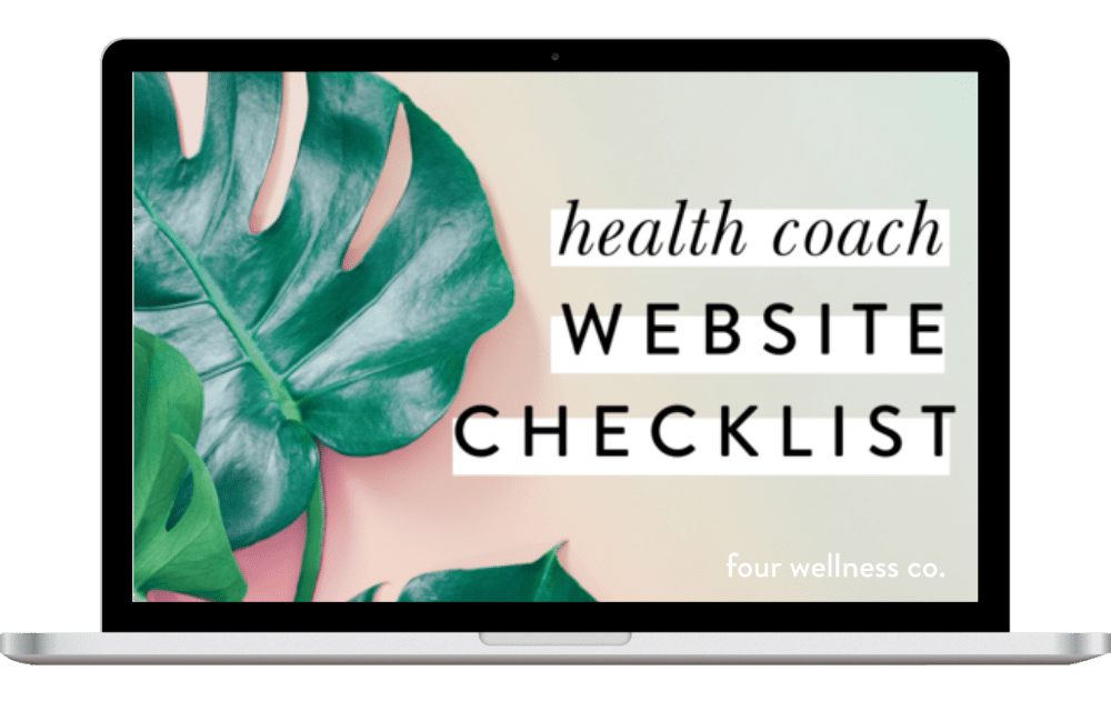
Perfect your health coaching website
Grab my free checklist for optimizing your wellness website!
It’s got all the big picture must-haves (& all the important little details!) to make your health coach website shine. ✨